I wanted to responsively redesign a subsection of the Florida Department of Children and Families (the FDCF) website with two other designers to help busy Floridian parents and guardians easily find the right childcare provider to take care of their children.
Redlined Website Issues, User Persona, User Scenario, User Flow, Wireframes, Prototypes (including Coded Prototype)
UX Designer, Front-end Developer
January - February 2021

In this case study:
Why redesign the Child Care section?
I am not the ideal target user, but I get overwhelmed trying to navigate the FDCF's Child Care section. I can only imagine how a parent or guardian of a child must feel. In two weeks, two designers and I tackled redesigning the Child Care section of the FDCF's website.
Sure, my team and I had problems using the website and detected some usability issues, but how do parents and guardians feel about the website as it existed? What troubles are they specifically having with the Child Care section of the website?
To answer these questions, we used the following process:

We started our project by conducting user research and annotating the website with usability issues we found.
While my other team members were forming questions to hone in on the user we were designing for, I completed an evaluation of the FDCF's website to highlight usability issues that I found with the site.
I should note that the Child Care section has two kinds of users: families/guardians of children and childcare providers. Though the Child Care section is focused primarily on childcare providers, we focused on redesigning the childcare searching process for families and guardians of children due to our limited time frame.
For this reason, my evaluation was mainly focused on the childcare search process.

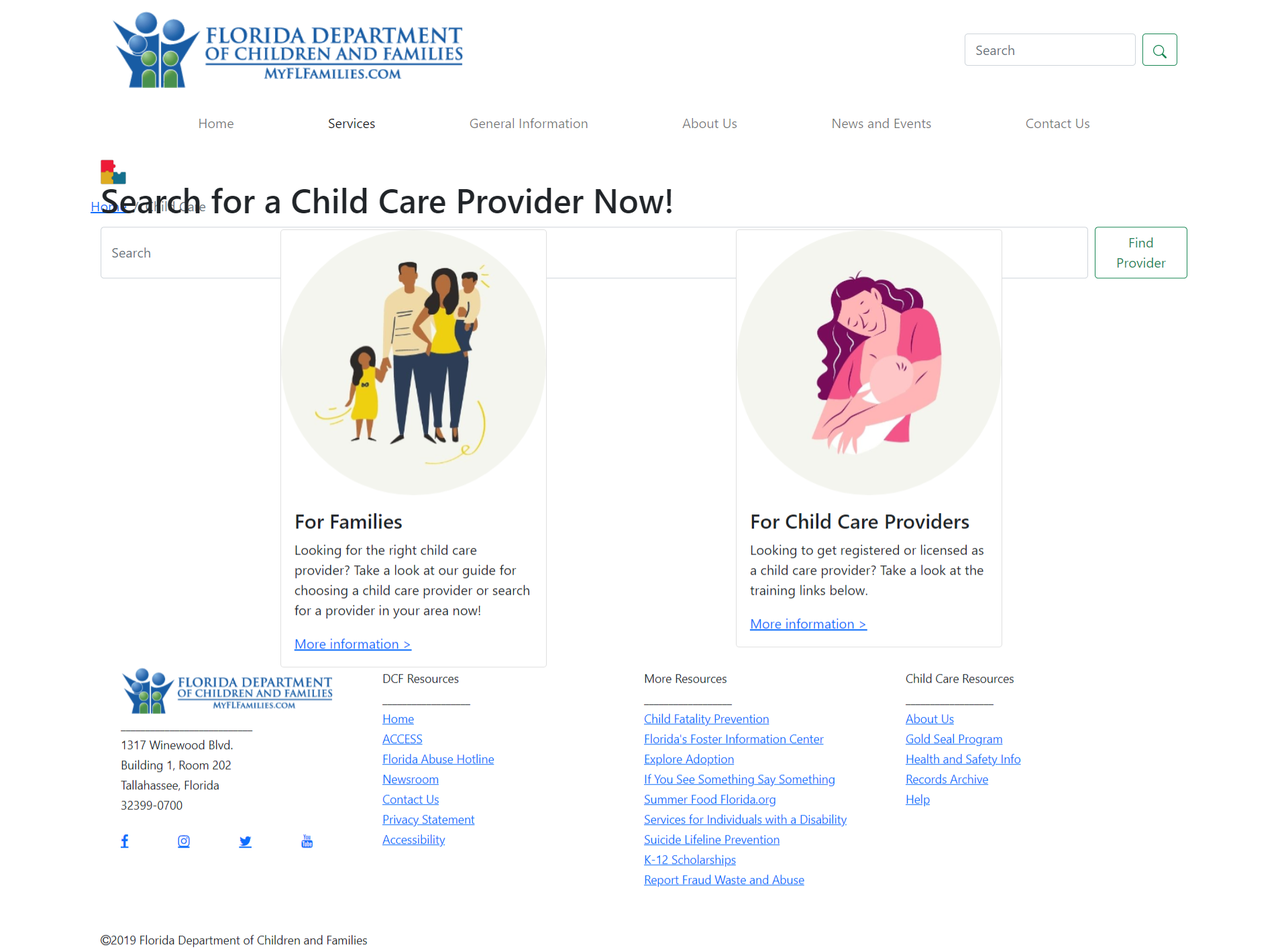
My evaluation of the homepage. The main issues I found were related to the navigation and organization of the page.
With the Child Care section's home page, I could find a childcare provider in three ways:
I found the search box method straightforward, but I did not realize that "Provider Search" in the "For Families" box was a link until I had hovered over it. I also thought that I had to click "More Options >>" to select "Provider Search".

The "Provider Search" link in the above dashed box is the same font and style as regular text in the below dashed box.
Actually, on my first visit to this home page, I had scrolled down to the mass of cards below the three colored boxes since I thought all three of these colored boxes were informational due to the bolded, unclickable information in the red "Contact Us" box.

Since the "Training and Registry Login" link was underlined in the far right dashed box and the "Contact Us" box did not contain any links, I did not believe "Provider Search" to be a link.
I immediately felt overwhelmed when the mass of cards at the bottom of the home page greeted me. Due to the proximity and varying sizes of the cards, I thought that the cards' placement was random. It took me a few minutes to realize that each column of cards followed the topic of the colored card that they were under.

Although the blue down arrow icon helps indicate the relationship between the top three boxes and the columns of cards below, this relationship is not immediately obvious.
We found that our users, a group of five parents, also had similar issues with the home page as I found. They were also dissatisfied with the visual look of the site and some of the iconography.
"What's going on here? It's like a huge jungle of options to choose from..." - Mark, 35
"I really don't know what is happening with all these options down here. They seem very randomly placed." - Liz, 32
Now that we knew what issues users were having with the website and more information about them thanks to user testing, we had a clearer vision of our target persona.

Meet Brianna Mitchell. She is the mother of Rachael and Ian, two elementary school children, who she loves dearly, but cannot provide care for after school due to her demanding job as a registered nurse. Worn out from a busy day of work, Brianna needs to efficiently find a childcare provider that caters to her and her children's needs.
There are many different places available in any local area in Florida that offer childcare. Although the childcare facilities must follow laws and regulations, each facility differs in its approach. Searching for a childcare facility is difficult for people seeking to meet specific needs for their families, and it is also hard to find information about specific places using the current Florida Department of Children and Family Services website.
How could we meet Brianna’s needs with a new and improved Child Care website? My teammates defined Brianna’s specific problem:
How might we redesign the FDCF’s Child Care section of their website so that parents and guardians can easily and quickly find the right childcare provider that fits within their constraints?
With Brianna’s needs and emotions in mind, I envisioned what her experience using the FCDF’s website to find a childcare provider would be like.

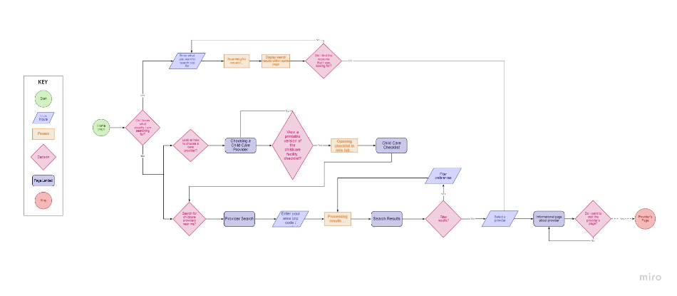
As outlined in the above scenario, the main goal of our redesign would be to connect Brianna to a childcare provider. With this goal in mind, I created a user flow detailing Brianna's journey from the Child Care section's home page to a childcare provider's page.

One of our first user flows, better seen here in Miro. We revised this flow to only include the task of using the search bar on the home page to search for a childcare provider due to our limited time.
After finalizing our user flow, my team and I created wireframes of the website pages to test on our users.

Our first version of the search results page after Brianna searches for a specific childcare provider. We needed to fix the navigation so that Brianna knew where she was in the Child Care section of this website.

Our final wireframe has main navigation and side navigation that shows where Brianna is in the Child Care section of the website. Based on user feedback, we also provided breadcrumbs to indicate location on the website.
While we were working on our wireframes, we gathered UI inspiration from the designs of other child care websites. We chose the bright, friendly rainbow colors of children’s playing blocks for the welcoming feeling that they induced.

Once we had fixed our wireframes, we applied our style guide to create our hi-fi clickable prototype.
As a test for our coding knowledge and to build our understanding of what developers deal with when they receive our designs, we coded part of our hi-fi prototype. We only coded three pages due to time constraints and our limited coding knowledge; this meant not coding any forms or tables.
With these limitations in place, we chose to code the finding of a childcare provider using the search box on the home page. The three pages we would have to code are the home page, search results page, and the synopsis page for the childcare provider. I tackled the home page and the synopsis page while my teammate handled the search results page. You can find the code we wrote here on Github.
Even with the help of Bootstrap's intuitive framework, we struggled with creating the website. The most difficult part of the coding process was understanding how Github Pages operates. When we first published our website, Github would not recognize our CSS file.
Previously, to apply the CSS styling, we had written the following in the head of our HTML code:
<link href="/css/styles.css" rel="stylesheet">This above code resulted in the following page:
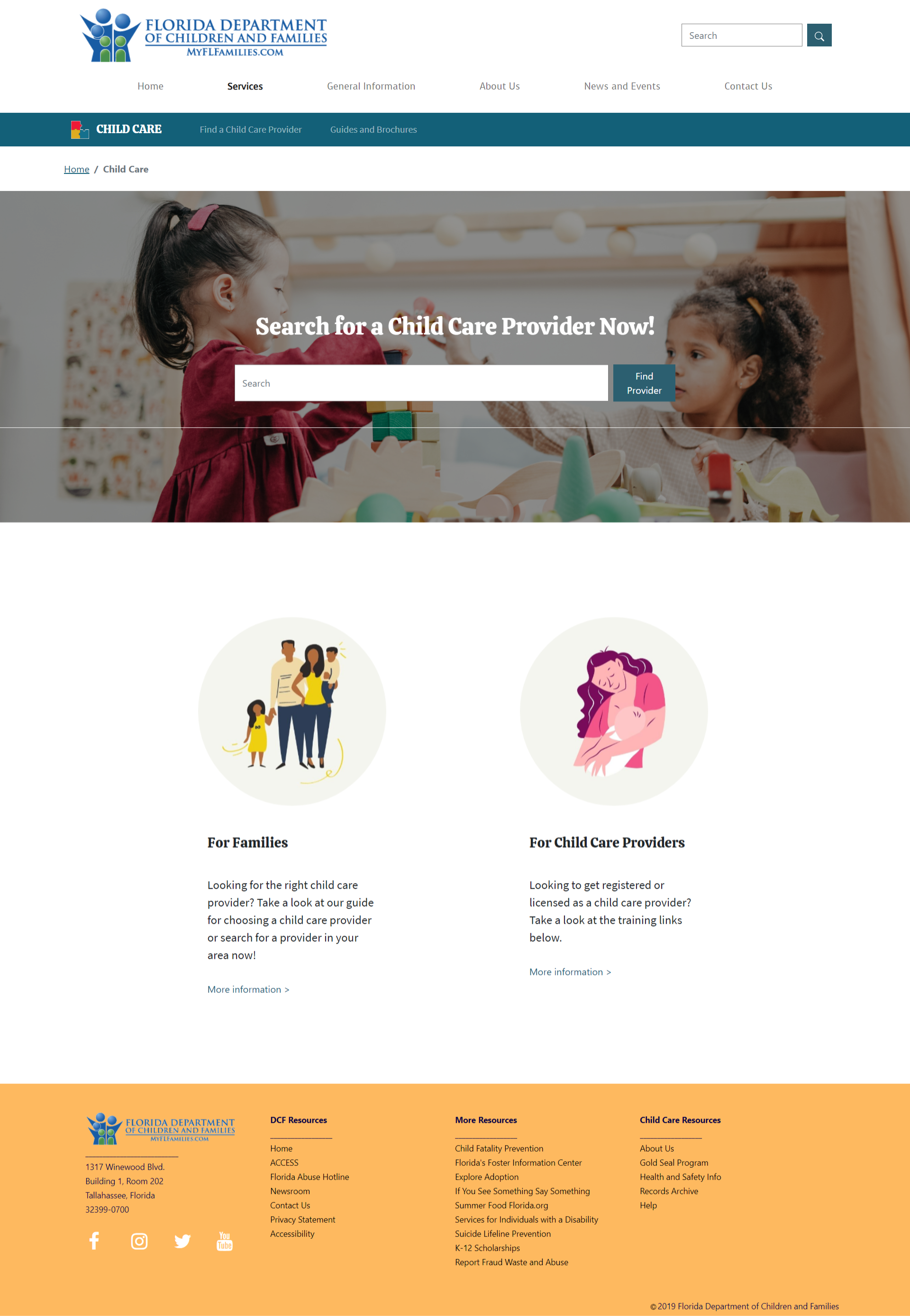
Only the headings and text of our home page is visible since the CSS is not linked properly.
After checking our code by using Google Chrome's DevTools, we realized that the issue was how we referenced the links to the CSS file in our HTML code. Changing the CSS styling amounted to understanding Github's way of recognizing file structure.
We thought that since our CSS folder lives in the same child-care-repo folder as our HTML pages, Github can find our CSS folder. However, since Github starts looking for sources starting from megham-cloud.github.io, Github wanted the CSS folder explicitly listed under the child-care-repo folder in the code.
Github thinks it will find our css folder in the megham-cloud.github.io folder, but Github needs to go into the child-care-repo folder before accessing our css folder.
To fix our issue, we must have the following code in the head instead:
<link href="/child-care-repo/css/styles.css" rel="stylesheet">Now we have the CSS styling applied:
Now all styling can be visible on the home page!
Though this may seem like a simple error, it was so easy to overlook the solution. We spent so much time pulling our hair out only to find the problem in a matter of minutes. I cannot begin to imagine how much frustration developers must feel when they encounter a roadblock, and I have so much respect for those that persevere until they find a way around it.
Though we had a few hiccups along the way, we finally had our coded prototype:
Click here to view the final coded prototype.
Handling navigation for even a subsection of such a large site was no easy matter. Though we simplified the navigation to fit Brianna’s needs for finding a childcare provider, for the actual website, we would have to consider modifying the navigation while being mindful of other users, who are mainly childcare providers. With more time, my team and I could have created another persona for a childcare provider and redesigned the Child Care section with them in mind.
Another challenge that I found particularly difficult was creating the user flow. Since we only had a couple of weeks to make both a clickable and a coded prototype, we could not add other tasks that Brianna could do besides search for a childcare provider, such as filtering for a provider based on her preferences. With more time and knowledge about coding forms for the website, my team and I could have included more search features into the final coded prototype to help Brianna find the right childcare provider.
Thank you for reading!