Quarantining during the coronavirus pandemic reminds me of how much I miss traveling and how life can be short. Why not create an efficient travel planning mobile app for today’s tourists to make the most of their time traveling?
User Interviews, User Persona, Value Proposition, Feature Prioritization, Journey Map, User Flow, Prototypes
UX Designer
August - September 2020

In this case study:
Traveling has been on my mind shortly since I started quarantining at home, so I wanted to design a new mobile app to help fellow travelers easily plan their travels after the pandemic ends. I will use the following process to design this app in four weeks (as this was my first design project, I followed this process very linearly):

First, I needed to understand what troubles and emotions travelers were having during their planning process by conducting user interviews. I also wanted to ask them about what travel planning apps or tools they were using to understand what competitor travel apps were doing right and where they could improve.
With four weeks on the clock, I took off to do user research.
To understand the minds of travelers, I had decided to ask the following questions:
I checked that my interviewees had at least one traveling experience in the past couple of years since I wanted to understand how today’s travelers planned.
From interviewing five travelers, who were all college-age students in their early 20’s, I learned that they had a common need of visiting unique, local-recommended places. Further questioning revealed that they wanted to avoid the same three to ten popular tourist attractions often over-hyped on the internet. Four out of five of my travelers planned trips based on word-of-mouth from other tourists who had been to the area or by asking locals, such as Airbnb hosts, what destinations they recommended. Most of my travelers wished to plan their travels to be more efficient about transportation time between tourist spots.
“We actually ended up going to a snowboarding resort thanks to our Airbnb host’s suggestion. That same Airbnb host recommended this fairly unknown underground garden, which was a really cool find.”- Andrew, 21
“The beach that we went to did not seem to live up to the reviews...I think the reviews kind of overhyped the beach. It took, like, two hours to get there.”- Nam, 22
I also surveyed 17 travelers to learn about their travel planning pains and the planning tools that they used. The survey results reveal that their most frustrating pain point is paying for expensive tourist attractions. Most of the respondents used Google Maps, Reddit, and Yelp to plan their trips.
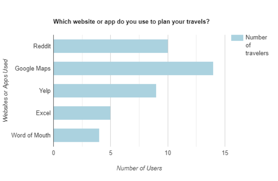
Google Maps, Reddit, and Yelp are my travelers' top three favorite travel planning app go-tos.
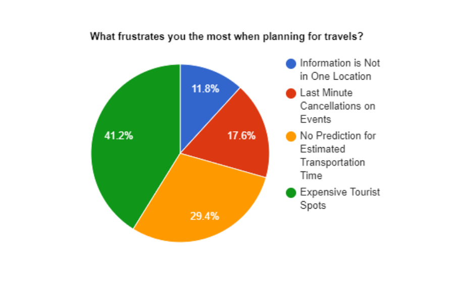
More than half of travelers surveyed find expensive tourist spots and predicting transportation time the most frustrating when planning.
Meeting my interviewees and studying the survey results helped me envision the traveler that I was designing for. Someone sharp-witted and savvy about their time...
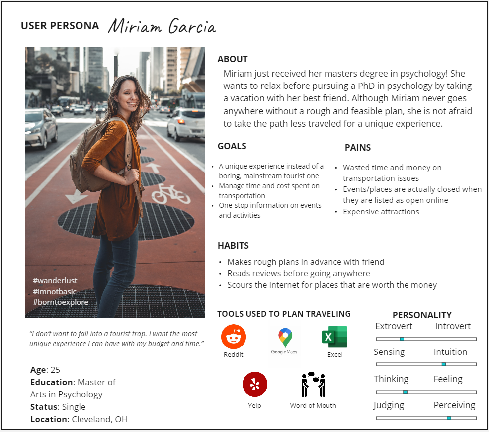
The Informed Traveler's user persona, Miriam Garcia.
Someone like Miriam Garcia. She is a sharp, bright master’s graduate planning to take a refreshing break in Costa Rica before pursuing a Ph.D. Miriam knows a tourist trap when she sees one online. Nothing annoys her more than being recommended the same ten tourist traps while feeling her hours spent searching go down the drain. Miriam needs to find unique experiences in the least time possible.
With Miriam here, I started to define a problem specific to her for my app to solve.
Miriam can easily plan which stops she wishes to make on her trips using search engines and reviews online; however, she always encounters the most popular tourist attractions that show up in the results or as recommendations by other travelers. Miriam is understandably frustrated with her time-draining hunt for traveling experiences. I need to give Miriam an easier way to view authentic, local-approved traveling experiences without having to dig through the internet to find them.
How might I create a travel planning app so that travelers can easily and quickly find authentic experiences that fit within their budget and vacation time?
Now that I have formed Miriam’s problem into an actionable statement, I could begin to brainstorm ideas for my travel app. First, I wanted to reaffirm Miriam’s needs and what my travel app could offer to meet them.

This value proposition canvas shows how we can meet the expectations and solve the frustrations of Miriam.
Around this time, I named my app The Informed Traveler as this app will serve as a one-stop-shop to help travelers like Miriam find unique places to visit thanks to input from locals.
To create a list of potential features for The Informed traveler, I noted what other travel planning apps were doing well. I considered Yelp's feature to see reviews from people who have been to a particular location and Reddit's feature to judge the quality of a comment based on the ratio of upvotes to downvotes it has. In addition, I also jotted down several features for The Informed Traveler that I thought Miriam would like, including the ability to see the safety rating of a location and the ability to sort travel destinations by personal preference.
After organizing these potential ideas based on which had the most impact on Miriam and would fit into the remaining weeks I had to design the app, I decided to design a review system for travel destinations and a filter for sorting travel destinations by personal preferences.

I focused my efforts on implementing the features within the green dashed line.
With features for my app settled, I mapped Miram's journey throughout The Informed Traveler in Figma.
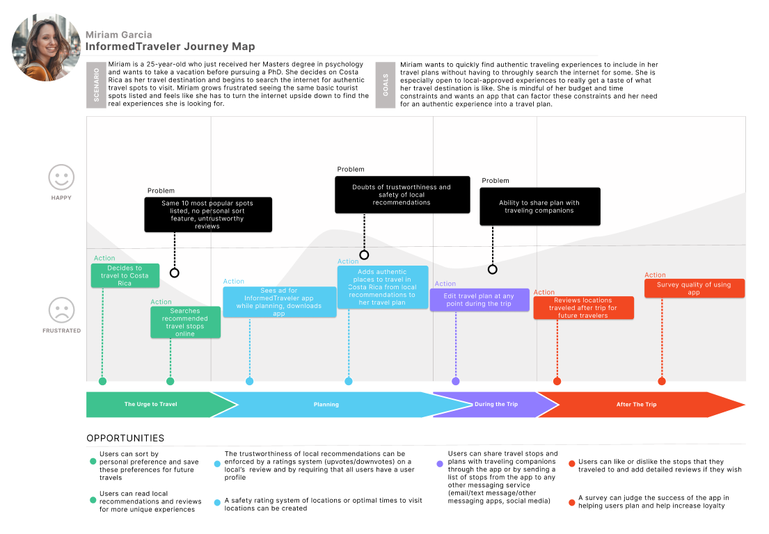
The above diagram helps me envision Miriam's emotional journey through The Informed Traveler.
Miriam is searching for destinations in Costa Rica to visit, but she keeps finding the same top ten popular locations populating her search. She notices an ad for The Informed Traveler and decides to give it a try. Miriam finds that she can easily and quickly plan a trip filled with authentic experiences thanks to The Informed Traveler.
To start prototyping, I translated Miriam’s journey through The Informed Traveler into a user flow, seen here in Miro.

As detailed in the flow, Miriam will be able to
Using Miriam's flow through the app, I rapidly sketched The Informed Traveler’s screens on paper.

A rough sketch of the first screen users are greeted with when using The Informed Traveler.

A rough sketch of the home page screen which shows that the user is logged in and recommends locations to visit.

A rough sketch of the filters used to sort for a user's personal preferences.
I only tested a couple of users due to time restraints, but since there were no major issues, I jumped straight into creating a low-fi prototype for The Informed Traveler using Adobe XD.
Feel free to interact with this low-fi prototype!
In these frames, I wanted to include an emoji feature for showing how travelers felt towards a location. After testing my low-fi prototype, users found the emoji reaction to be extraneous and would rather use the upvote/downvote system for showing appreciation of a location and leave a comment if their emotions were strong enough.
Other popular feedback included users needing the ability to easily distinguish the filter button for sorting traveling destinations and the ability to distinguish comments made by travelers versus comments made by locals.
With this knowledge in mind and only a half a week remaining, I revised my low-fi prototype to create the following high-fidelity version.
Feel free to interact with this prototype!
As I just focused on the UX aspect of designing The Informed Traveler and ensuring that the design solved Miriam’s problem, I considered my design finished for now.
My takeaway from this experience is not to get caught up in feature creep, like allowing users to add an emoji reaction to a travel spot they had been to. I already minimized the number of features to include from user interviews and testing, so why spend more time thinking about more features?
For the future of The Informed Traveler, I may consider updating the UI of the app to give it more personality and enjoyment for the users.
For future projects, I will focus more on prioritized features. I will also try to remember to iterate as early and often as possible, so I do not get too caught up in one idea for a project.
Thank you for reading!